The Walk of Life
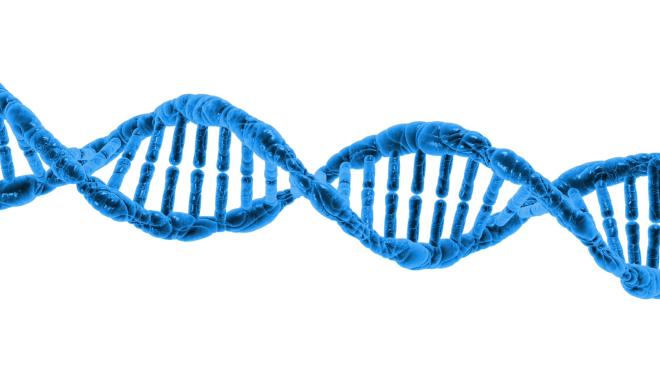
In the course of our genomics research at Lab41, we often look at raw DNA sequences. Unfortunately, DNA sequences don’t come to us looking like this:

Rather, they come to us looking more like this:
>Human
ATGGTGCATCTGACTCCTGAGGAGAAGTCTGCCGTTACTGCCCTGTGGGGCAAGGTGAACGTGGATGAAGTTG
GTGGTGAGGCCCTGGGCAGGCTGCTGGTGGTCTACCCTTGGACCCAGAGGTTCTTTGAGTCCTTTGGGGATCT
GTCCACTCCTGATGCTGTTATGGGCAACCCTAAGGTGAAGGCTCATGGCAAGAAAGTGCTCGGTGCCTTTAGT
GATGGCCTGGCTCACCTGGACAACCTCAAGGGCACCTTTGCCACACTGAGTGAGCTGCACTGTGACAAGCTGC
ACGTGGATCCTGAGAACTTCAGGCTCCTGGGCAACGTGCTGGTCTGTGTGCTGGCCCATCACTTTGGCAAAGA
ATTCACCCCACCAGTGCAGGCTGCCTATCAGAAAGTGGTGGCTGGTGTGGCTAATGCCCTGGCCCACAAGTAT
CACTAA
>Rat
ATGGTGCACCTGACTGATGCTGAGAAGGCTGCTGTTAATGGCCTGTGGGGAAAGGTGAACCCTGATGATGTTG
GTGGCGAGGCCCTGGGCAGGCTGCTGGTTGTCTACCCTTGGACCCAGAGGTACTTTGATAGCTTTGGGGACCT
GTCCTCTGCCTCTGCTATCATGGGTAACCCTAAGGTGAAGGCCCATGGCAAGAAGGTGATAAACGCCTTCAAT
GATGGCCTGAAACACTTGGACAACCTCAAGGGCACCTTTGCTCATCTGAGTGAACTCCACTGTGACAAGCTGC
ATGTGGATCCTGAGAACTTCAGGCTCCTGGGCAACATGATTGTGATTGTGTTGGGCCACCACCTGGGCAAGGA
ATTCTCCCCCTGTGCACAGGCTGCCTTCCAGAAGGTGGTGGCTGGAGTGGCCAGTGCCCTGGCTCACAAGTAC
CACTAA
>Rhesus
ATGGTGCATCTGACTCCTGAGGAGAAGAATGCCGTCACCACCCTGTGGGGCAAGGTGAACGTGGATGAAGTTG
GTGGTGAGGCCCTGGGCAGGCTGCTGGTGGTCTACCCTTGGACCCAGAGGTTCTTTGAGTCCTTTGGGGATCT
GTCCTCTCCTGATGCTGTTATGGGCAACCCTAAGGTGAAGGCTCATGGCAAGAAAGTGCTTGGTGCCTTTAGT
GATGGCCTGAATCACCTGGACAACCTCAAGGGTACCTTTGCCCAGCTCAGTGAGCTGCACTGTGACAAGCTGC
ATGTGGATCCTGAGAACTTCAAGCTCCTGGGCAACGTGCTGGTGTGTGTGCTGGCCCATCACTTTGGCAAAGA
ATTCACCCCGCAAGTGCAGGCTGCCTATCAGAAAGTGGTGGCTGGTGTGGCTAATGCCCTGGCCCACAAGTAC
CACTAA
>Chimpanzee
ATGGTGCACCTGACTCCTGAGGAGAAGTCTGCCGTTACTGCCCTGTGGGGCAAGGTGAACGTGGATGAAGTTG
GTGGTGAGGCCCTGGGCAGGCTGCTGGTGGTCTACCCTTGGACCCAGAGGTTCTTTGAGTCCTTTGGGGATCT
GTCCACTCCTGATGCTGTTATGGGCAACCCTAAGGTGAAGGCTCATGGCAAGAAAGTGCTCGGTGCCTTTAGT
GATGGCCTGGCTCACCTGGACAACCTCAAGGGCACCTTTGCCACACTGAGTGAGCTGCACTGTGACAAGCTGC
ACGTGGATCCTGAGAACTTCAGGCTCCTGGGCAACGTGCTGGTCTGTGTGCTGGCCCATCACTTTGGCAAAGA
ATTCACCCCACCAGTGCAGGCTGCCTATCAGAAAGTGGTGGCTGGTGTGGCTAATGCCCTGGCCCACAAGTAT
CACTAA
In other words, basically gibberish. To the naked eye, the sequences appear to be identical.
There has to be a better way to visualize these complex sequences than just looking at the raw text.
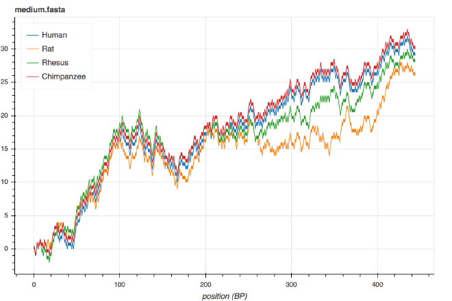
Enter Squiggle, Lab41’s new DNA visualization algorithm. It turns the same sequences above into clean, unique two-dimensional graphs:

Fig. 1. The Squiggle visualization for the $\beta$-globin genes of humans, rats, Rhesus macaques and chimpanzees.
Let’s break down what it is that we’re seeing to get a sense for why this is such a powerful way to look at DNA sequences.
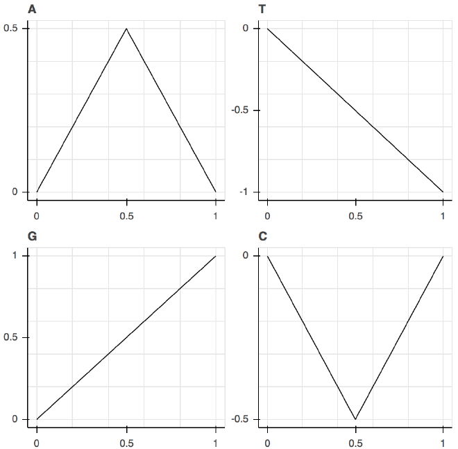
Using Squiggle, we represent each letter as its own distinct shape:

Fig. 2. The shapes of the various letters of DNA used to make Squiggle graphs.
We then connect those shapes tip-to-tail to give each sequence of As, Ts, Gs, and Cs its own distinctive shape, which in mathematical parlance is called a two-dimensional walk.
This process has some distinct advantages over other algorithms for DNA visualization that have been proposed before. Specifically, it’s designed for human interpretation.
Take, for example, the $x$-coordinate. In this scheme, the $x$-coordinate corresponds directly to the $x^{\text{th}}$ letter of the DNA sequence. When we see the graphs of two DNA sequences start to diverge around position $x=260$ in the Figure 1, we can tell that the sequences start to differ more around letter 260.
But wait, there’s more! The ratio of Gs and Cs to As and Ts is an important feature of a DNA sequence. Because Gs and Cs have a net positive effect on the $y$-coordinate of the sequence, and As and Ts have a net negative effect on the $y$-coordinate of the sequence, whether there are more Gs and Cs or As and Ts can be inferred from whether the ending value of the graph is above or below the $y$-axis. Furthermore, variations in the ratio inside sequences can be seen as peaks and valleys.
Finally, consider the relationship between each sequence’s graph. Note that the blue and the red (human and chimpanzee, respectively) lines are really close to each other, followed by the rhesus in green and the rat in orange a bit further away.

Fig. 3. A tree representing the evolutionary relationship between the organisms in the graph. Generated using iTOL.
It turns out that this relationship exactly matches the evolutionary relationship between the species.
To sum things up, the Squiggle algorithm allows you to quickly visualize DNA sequences’ relationships to each other, providing a snapshot of their similarity (and differences), and may prove useful for inferring infer their evolutionary relationships, all at a glance. There’s just one thing missing: an implementation.
One of the recurring problems in the two-dimensional DNA sequence visualization literature is a lack of open-source implementations. Lab41 is committed to creating open source software, so we made a Python library implementing the algorithm (as well as some of the other visualization algorithms, just to be safe) and made a snazzy command line interface allowing for quick visual inspection of files containing DNA sequences.
In the future, we’d like to make a web server version to make it even more accessible. (Update 6/2019: We did!) In the meantime, we’re eager to see how people use Squiggle, from research to art.